 |
| Obi Wan tells Luke our truths are founded in our point of view. |
Obi-Wan: "So what I told you was true, from a certain point of view."
Luke: "A certain point of view?"
Obi-Wan: "Luke, you're going to find that many of the truths we cling to depend greatly on our own point of view."
Just like Obi-Wan, Star Wars fans have their points of view - many love the models used in the Star Wars movies and dump on the 'green screen' Computer Graphics (CG) in the prequels. Why? People love the tangible, physical models and shun the 'green screen' fantasy representation of reality.
 |
| George Lucas with models (left) and 'green screen' (right). |
In the same way, CityFloodMap.Com loves physical data. We love graphs that help represent physical, factual measurements. You could say that to us, 'infographics' are the anti-data, dark force, 'green screen' of our industry - they are quick and convenient with no real depth and little value.
But infographics are de rigueur in communications on extreme weather and climate change. They meet the public's need for 'satisfice-ability', recognizing that people scan information quickly and in sections, and rarely read entire documents - they scan and satisfice.
| Are you "satisficed" yet? Infographic by RSA Insurance. |
 |
| How about now? Do the big rain drops to the left help explain the big dollar signs to the right? Another RSA Infographic. |
Unfortunately, the "scan and satisfice" crowd is missing out on the meaningful information that can help inform beliefs, and provide a more truthful, physical perspective of the world.
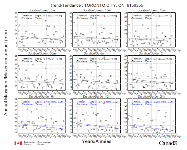
In contrast to the 'green screen' of RSA infographics, here are some physically measured trends in annual extreme rainfall in Toronto from Environment Canada's Engineering Climate Dataset:
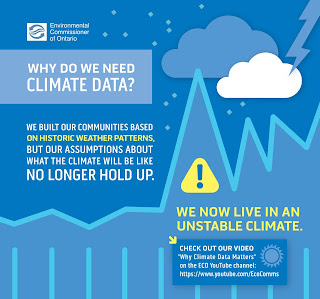
And to compare, here is an infographic 'green screen' from the Government of Ontario saying assumptions about weather patterns no longer hold up - now is that a truth someone clings to or a physical fact?:
 |
| Ironically, says we need data but provides none. |
Using the 'force' of real data to battle the infographic mind tricks that make us 'scan and satifice', we can explore a whole lot of real, physical rainfall trend data in the graph below. Basically, only 3% of rainfall trends are increasing (dark red like Darth Vader's lightsaber):
 (Read like Yoda) "But strong is it, the force in you? Or by this 'green screen' infographic from Intact Insurance, swayed will you be?":
| Intact Insurance Infographic based on IBC's Telling the Weather Story statement. |
(Read like Padawan Learner) "Hmmm bigger cloud ... darker cloud ... they told me that was bad in Jedi Academy. Yup I think that is bad. Reminds me of the stormy planet of Komino ... wait Komino was all 'green screened' in Attack of the Clones, it wasn't real at all."
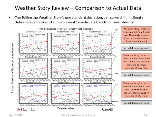
Here is the Intact 'info' (based on Insurance Bureau of Canada's Telling the Weather Story) superimposed on the actual, physically-based Environment Canada data:
Physical data on rainfall extremes is to truth about flooding as a physical R2-D2 model is to Star Wars - essential. 'Green screen' infographics on weather patterns is to truths about flooding as CG Jar Jar Binks is to Star Wars - shallow and meaningless.
May the force of physical data be with you! May they shape the truths you cling to.
Extreme rainfall trends in Canada (Environment Canada Engineering Climate Datasets) are documented in the following posts:
Long-term Station Table: http://www.cityfloodmap.com/2015/12/long-term-climate-change-short-term.html
Environment Canada Denies Changes: http://www.cityfloodmap.com/2015/10/bogus-statements-on-storms-in-cbcnewsca.html
Contradicting Insurance Industry Claims: http://www.cityfloodmap.com/2015/12/trends-in-canadian-shortduration.html

