Environment and Climate Change Canada has updated and extended the Engineering Climate Datasets as noted in the last post. This post shows the updated trends in extreme rainfall intensities across long-term southern Ontario climate stations - the good news is that intensities have not increased. This means that infrastructure built in the last few decades is not undersized considering current rainfall design intensities.
Previously trends in some southern Ontario intensity-duration-frequency (IDF) values and annual maximum series were evaluated in my paper "Evidence Based Policy Gaps in Water Resources: Thinking Fast and Slow on Floods and Flow" in the Journal of Water Management Modeling: https://www.chijournal.org/C449
Further analysis of trends in long-term stations has been presented in this blog and in the National Research Council of Canada's "National Guidelines on Undertaking a Comprehensive Analysis of Benefits, Costs and Uncertainties of Storm Drainage and Flood Control Infrastructure in a Changing Climate" - that guideline included trends in southern Ontario up to Version 3.10, as presented in the earlier post: https://www.cityfloodmap.com/2022/02/nrc-national-guidelines-on-flood.html
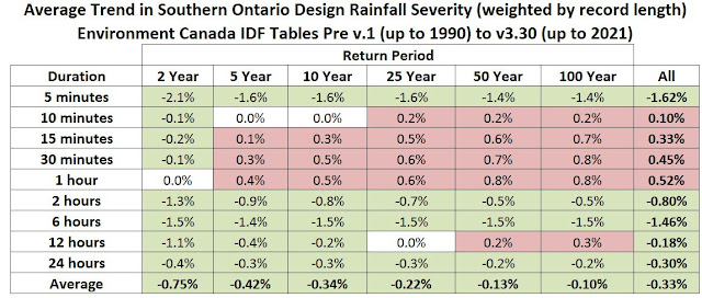
The southern Ontario IDF trend data has now been updated based on the Version 3.3 dataset released in May 2023 and includes some station updates to 2021- 9 of the 21 stations were updated. The following table and charts show the trends in 2-year to 100-year design rainfall intensities.
The table below shows changes in average intensity - decreases since 1990 are shaded in green and increases are in red. Note the the trends are weighted by record length. Across all durations and return periods the average decrease is - 0.33 %. That is a slight decrease from the Version 3.20 datasets, meaning less intense rainfall when more recent data has been included. On average 30 statistics decreased while 20 statistics increased.
It is noteworthy that none of the 2-year intensities increased and the largest increase was 0.8% for 100-year intensities at one station for durations of 30 minutes and 1 hour. Overall for 21 stations 100-year intensities were virtually unchanged with the average intensities decreasing 0.1% after 30+ years, and the median increasing 0.2%. Skewed data statistics should increase over time with longer records - check out this post for more on that: https://www.cityfloodmap.com/2016/02/ontario-climate-change-trends-going.html
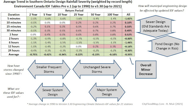
This last table is annotated to show how various statistics are used in design. Infrastructure that has been designed considering short duration intensities like local sewer systems are now subject to virtually the same 2 to 10-year design intensities that existed over 30 years ago. Ponds designed for long duration higher return periods (e.g., 100-year events) are now subject to virtually the same intensities, or design event volumes, they were subject to decades ago as well.


