Showing posts with label 100-year storm. Show all posts

Toronto Extreme Rainfall Trends - 100-Year Daily Rainfall in Engineering Climate Datasets

Previous posts have reviewed trends in extreme rainfall across Canada, in various regions including southern Ontario, and in the Greater Toronto Area (GTA), including Toronto and Mississauga where long-term climate data is available for review.

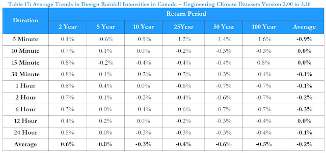
Projections of future extreme rainfall increases are commonly made as part of climate change studies. A review of past trends in extreme rainfall was made in the 2021 National Research Council flooding cost benefit guidelines, as summarized in a previous post. The following chart was included in those guidelines and shows the trends in 100-year daily rainfall at two GTA climate stations in downtown Toronto and at Pearson International Airport in the adjacent municipality of Mississauga.

Toronto 100-Year Rainfall Trends and Projections

The chart shows the 100-year rainfall depth using data records up to 1990 and then adding more recent data up to 2017. The chart shows that the 100-year rainfall at Pearson Airport/Mississauga has been decreasing slightly when recent data is added after 1990. Meanwhile the Toronto rainfall has been increasing slightly (see dotted and dashed black lines on the chart above for the trends).

Several climate studies have projected that the 100-year daily rainfall would increase over coming decades as shown on the chart. The Toronto's Future Weather & Climate Driver Study by SENES projected a doubling of this rainfall statistic by 2040-2049, relative to a 2000-2009 baseline value (see the orange dashed line on the chart above, where the 2000-2009 value is shown at 2005 and the 2040-2049 value is shown at 2045).

Some additional data has been analyzed by Environment and Climate Change Canada for the Toronto climate station, now including data up to 2021. This allows the 100-year daily rainfall statistic to be updated with a few more years of data. The chart below shows the additional Toronto data point circled in yellow at 2021.

100 Year Daily Rainfall Trends in Toronto and Mississauga and Climate Projections

While the Toronto rainfall statistic up to 2017 was 97.5 mm, the value up to 2021 decreased slightly to 97.3 mm. The value up to 2017 reflected the prior July 8, 2013 extreme event, creating a jump after 2007 when the value was slightly lower at 94.7 mm. As more data is observed below the 2013 extreme, the statistic should continue to decrease as more data is added and analyzed.

The take-away? Observational data, including data up to 2021, does not support the projected significant increases in 100-year daily rain in climate studies. The Toronto data is available over the period of 1940 to 2021.

How far off are the projected increases in extreme rainfall? The Toronto Future Weather & Climate study projected a theoretical 31mm/decade increase over 40 years - that was for Pearson Airport climate station. Actual data at Pearson Airport shows an observed increase of only 3.1mm/decade.  This considers a value of 115.1 mm in the middle of the 1950-2003 period and a value of 125.5 mm for 2003-2017 - that later value is estimated to generate the current value of 117.3 mm by using a weighted average across all years from 1950 to 2017. For Toronto the actual increase is only 2.0 mm/decade.

On average the GTA (Toronto and Pearson/Mississauga) increase is about 2.5 mm/decade, or less than a tenth of almost 31mm/decade projected in the SENES climate/future weather study.

***

Further reading in previous posts on extreme rainfall trends:

1) Rainfall intensity trends in Canada:

a) 226 long term climate stations in the Engineering Climate Dataset are used to show actual trends between rain intensity statistics up to 2007 and then up to 2017: https://www.cityfloodmap.com/2020/12/design-rainfall-trends-in-canada.html

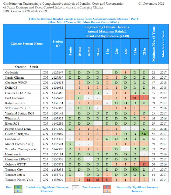
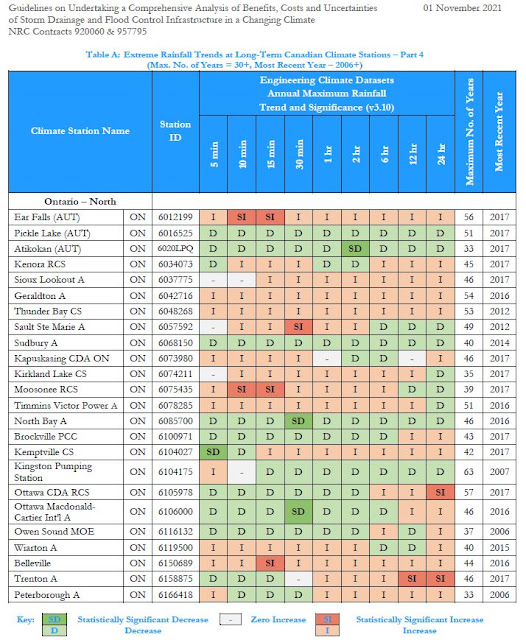
b) more of the above plus observed annual maxima rainfall trends as reported in the 2021 National Research Council of Canada (NRC) "National Guidelines on Undertaking a Comprehensive Analysis of Benefits, Costs and Uncertainties of Storm Drainage and Flood Control Infrastructure in a Changing Climate": https://www.cityfloodmap.com/2022/02/nrc-national-guidelines-on-flood.html

2) Rainfall intensity trends in Southern Ontario:

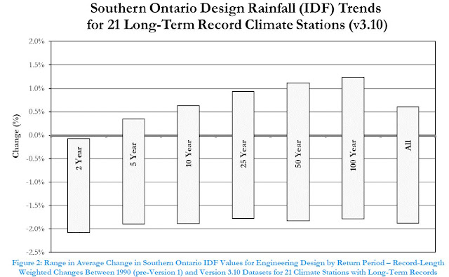
a) ECCC's Engineering Climate Dataset Intensity Duration Frequency (IDF) trends for long-term southern Ontario climate stations, comparing statistics up to 1990 and current values (v3.3 datasets with some station data up to 2021): https://www.cityfloodmap.com/2023/05/southern-ontario-extreme-rainfall.html

3) Rainfall extreme reporting (?) in the media (including Toronto, Mississauga trend review):

a) Thinking Fast and Slow About Extreme Weather and Climate Change, inspired by the late Daniel Kahneman (RIP good sir), exploring the cognitive biases in extreme rainfall reporting in the media: https://www.cityfloodmap.com/2015/11/thinking-fast-and-slow-about-extreme.html

b) my paper with "Thinking Fast and Slow" themes published in the Journal of Water Management Modelling with the title "Evidence Based Policy Gaps in Water Resources: Thinking Fast and Slow on Floods and Flow": https://www.chijournal.org/C449


4) Local studies that observed no increases in design rainfall when updating IDF values:


While media and the insurance industry has repeated that climate change has been responsible for increased flood damages and insurance claims over past decades, the lack of increases in extreme rainfall means that other factors are at play. These include fundamental changes in hydrology in urbanized communities, e.g., increased watershed development and intensification. See previous posts for some examples of expanding urbanization in Ontario communities over previous decades: https://www.cityfloodmap.com/2016/08/land-use-change-drives-urban-flood-risk.html

When fact checkers look into media statements regarding extreme rainfall trends, including the CBC and Radio Canada Ombudsmen offices, data shows no overall increase in extreme rain across Canada. This post shares corrections made by the CBC over recent years: https://www.cityfloodmap.com/2019/06/cbc-correcting-claims-on-extreme.html

NRC National Guidelines on Flood Control Cost-Benefit Analysis Indicate 100-Year Storm Intensities Not Increasing

The National Research Council of Canada (NRC) has released the National Guidelines on Undertaking a Comprehensive Analysis of Benefits, Costs and Uncertainties of Storm Drainage and Flood Control Infrastructure in a Changing Climate.

The full guidelines are available here to download: https://nrc-publications.canada.ca/eng/view/object/?id=27058e87-e928-4151-8946-b9e08b44d8f7

These guidelines delve into many topics to support comprehensive benefit cost analysis. As the effects of a changing climate on flood damages (and adaptation benefits of reducing them) are considered, trends in extreme rainfall across Canada are reviewed in the foundation research. The review shows that on average extreme rainfall intensities have not increased when the most recently observed data is considered.

Extreme rainfall intensities can be characterized by the high return period values in Intensity-Duration-Frequency (IDF) statistics. For example the 100-year rainfall intensity would be the rate of rainfall over a range of durations that has a 1% chance (i.e., 1/100) of occurring in a single year, based on the statistical analysis of past observations.   Similarly 50-year storm rainfall rates have a 2% change of occurring during any year (i.e., 1/50), 25-year rainfall has a 4% chance, 10-year has a 10% chance, etc..

The guidelines present the following table showing 2-year to 100-year design rainfall intensity trends at 226 climate stations across Canada for durations of 5 minutes to 24 hours (Appendix E, Table 17):


As shown, 100-year storm intensities have decreased on average by 0.5% from the v2.00 to the v3.10 Engineering Climate Datasets. On average the derived 10-year to 50-year rainfall rates have decreased as well.

IDF intensity values are derived from observed annual maximum rainfall values, called an annual maximum series (AMS). One can look at the trends in AMS values to understand how derived 'return period' intensities are changing over time. The NRC guidelines summarized Environment and Climate Change Canada's analysis of these trends across Canada in the following table (Appendix E, Table 11):


The table counts instances where observed rainfall has decreased significantly (i.e., a statistically strong trend), has decreased (a weaker trend), has not changed, has increased (a weak trend), or has increased significantly (a strong trend).  Across Canada the totals show decreasing trends in 131+2235=2366 data points and increasing trends in 2526+251=2777 data points. And 266 data points showed no change. This summary indicates that both decreases and increases are occurring, with slightly more increases.

The NRC guidelines present additional analysis of more regional trends as well. This can help practitioners understand recent changes in extreme rainfall affecting local flood damages. For example the AMS trends in southern and northern Ontario are presented in the following two tables (Appendix E, Annex E1, Table A Part 3 & Part 4):

Ontario is shown to have increasing and decreasing AMS values (i.e., annual maximum observed rainfall) that varies by location (climate station) and duration. In some cases annual maximum rainfall is decreasing/unchanged or increasing/unchanged for all durations while in others short duration values have increased while long duration values have decreased - or vise versa. For example:  

Stations with all decreasing/unchanged trends for all durations:

  • Elora RCS
  • Hamilton A
  • Toronto City
Stations with all increasing/unchanged trends for all durations:
  • Toronto North York
  • Sioux Lookouk
  • Geralton A
  • Thunderbay CS
  • Belleville
Overall there are more decreasing AMS trends in southern Ontario (top table) than in northern Ontario. (Note the divide for southern and northern climate stations was taken as latitude of 44 degrees so Brockville, Kingston, Kemptville and Ottawa stations are in the northern group.)

The changes in IDF design intensity values for southern Ontario follow the regional trends in AMS values. This is what is expected since IDF statistics are derived from the observed AMS data. While Table 17 above showed changes in IDF values between the v2.00 and 3.10 datasets, essentially the difference resulting from accounting for the last 10 years of observations, southern Ontario IDF changes over a longer period were assessed in the NRC guidelines. The following figure shows the range in design intensities at long term stations since 1990 (Appendix E, Figure 2): 


Overall 2-year rainfall intensities, representing smaller storm severity, have decreased. Meanhile 100-year intensities have increased and decreased. This analysis aggregates all durations. Given the variability from station to station shown earlier (e.g., Toronto City has decreasing trends while Toronto North York has increasing trends, trends in long and short durations are inconsistent at individual stations), there is a benefit in aggregating larger sets of data (across durations and geography) to estimate overall regional trends.

(Aside - the analysis of southern Ontario IDF trends in the NRC guideline presented above were recently updated to reflect the v3.20 datasets and average trends for durations within each return period were analyzed as well. Results are presented in this post: https://www.cityfloodmap.com/2021/10/rainfall-design-intensities-in-southern.html


The figure above shows more consistent decreases across durations for the small storm intensities (i.e., 2 to 5-year return periods.)


Future Extreme Rainfall IDF Values in Canada Include Decreasing Intensities for Some Emissions Scenarios and Regions

 A research paper Assessment of non-stationary IDF curves under a changing climate: Case study of different climatic zones in Canada in the August 2021 Journal of Hydrology: Regional Studies by Silva et al. projected future IDF curves in several regions of Canada under various emissions scenarios (link: https://www.sciencedirect.com/science/article/pii/S2214581821000999)A previous post discussed historical annual maximum rainfall at climate stations with long-term records and noted stationary values for several stations and rainfall durations (i.e., no change in annual extreme rainfall observations) - see post: https://www.cityfloodmap.com/2021/12/has-extreme-rainfall-become-more-severe.html.

The paper presents changes in typical design intensities for:

i) 120-minute (2-hour) 5-year return period values (e.g., along with intensities for shorter durations, these data are used to design storm sewers in many jurisdictions), and

ii) 1440-minute (24-hour) 100-year return period values (e.g., used to design stormwater detention facilities, or used to derive design hyetographs for floodplain mapping in some watersheds and for RDII analysis in some wastewater collection networks prone to wet weather impacts, etc.).

Future projections are made for the period 2020-2100. The main paper presents percentage changes for the RCP8.5 emissions scenario as follows:


The charts on the above left show changes for stationary distributions, and Hamilton (HAM) and London (LON) columns are highlighted. Those stations were shown to have stationary annual maximum extreme rainfall in the paper, as shared in the previous post. The London and Hamilton 100-year rainfall intensities increase from 4 to 13 percent under the RCP 8.5 emissions scenario (stationary table on the bottom left). 

Under the RCP8.5 scenario the return period of today's 100-year 24-hour becomes smaller, meaning that intensity can occur more frequently than the 1% chance per year today. Today's 5-year 2-hour intensities become more frequent as well. The paper shows these projected intensities: 


So a 100-year return period 24-hour (1440 minute) intensity becomes a 73.5 year return period intensity or a 18.5 year return period intensity in Hamilton and London, Ontario, respectively.

Supplemental material shows that for other emissions scenarios intensities do not increase
at these Great Lakes climate stations for the rare 100-year intensities. See below:

For a RCP2.6 scenario, the 100-year intensities in the table (again on the bottom left for the stationary model), decrease by 3 percent or are unchanged. With those decreases the return period of today's design intensities become longer, meaning today's intensities are less frequent. That means reduced risks for extreme rainfall compared to today.

The RCP4.5 scenario projected 100-year intensities are essentially unchanged in Hamilton and up slightly in London: 


So what are future rainfall intensities in Southern Ontario? That depends on the emissions scenario you select.

Recently the Pacific Climate Impacts Consortium questioned if RCP8.5 should be considered as 'business as usual', that is, is it the most likely future scenario? See a detailed discussion in their Science Brief: https://www.pacificclimate.org/sites/default/files/publications/Science_Brief_39-June_2021-final.pdf, an excerpt which is below.


The Science Brief concludes that:

"Given that RCP8.5 is not the most "likely" outcome of emissions following business-as-usual or stated policy intensions, its reasonable to refer to it as a high emissions scenario instead of business-as-usual."

A previous post also noted that others have also questioned the validity of RCP8.5:


ii) Roger Pielke Jr. and Justin Ritchie as reported in Issues in Science and Technology (https://issues.org/climate-change-scenarios-lost-touch-reality-pielke-ritchie/). 

Therefore, the paper's projections for future intensities under RCP8.5 could be considered in stress tests of infrastructure or hydrologic systems. Such tests can identify low-regret design modifications that can be incorporated initially, or to identify future adaptive management if modifications today would be too costly and yield uncertain and limited benefits (i.e., based on the limited likelihood of such severe intensities occurring with less likely scenarios). Assessment of most-likely conditions should consider projected future intensities based on emissions under stated policy intentions, such as presented in the paper's supplemental material (e.g., RCP4.6).

Both the US Federal Highways Administration (FHWA) and the American Society of Civil Engineers (ASCE) have developed risk-based approaches to designing infrastructure for future climate conditions. 

The Canadian government describes a method for projecting future rainfall intensities based on temperature-scaling, considering RCP4.5 and RCP8.5 (see previous post  https://www.cityfloodmap.com/2021/12/adjusting-idf-curves-to-account-for.html). The approach notes one should:
  • Apply risk-based decision-making to choose the future extreme rainfall value that is most appropriate for asset risk thresholds.  For example, if rainfall consequences to infrastructure are severe, consider applying upper end of projected future RCP 8.5 1-hour 1-in-100-year rainfall intensities to infrastructure design.
A robust risk-based approach could also consider other scenarios such as RCP2.6 as well.

It is noted that the ASCE identifies levels of analysis in its Manual of Practice 140 entitled Climate-Resilient Infrastructure: Adaptive Design and Risk Management. In Chapter 7 Adaptive Design and Risk Management the manual provides recommended levels of climate analysis based design life and risk category. The following table excerpt shows the risk categories for buildings and other structure:


These table excerpts show the levels of analysis based on risk category and design life (top table), and the climate analysis characteristics.

So for buildings and structure with design life up to 75 years, where the risk category is low (Risk Category I, meaning low risk to human life), Level I climate analysis using "extremes based on historical observations is appropriate". For a longer design life beyond 75 years, the Risk Category I buildings and structures (low risk) should also include climate projections per climate analysis Level II. In my opinion, a deterministic future projection could be considered for such analysis based on a likely scenario (e.g., RCP 4.5).

Where there is a 'substantial risk to human life' or hazardous or toxic materials involved under Risk Category III, Level III analysis is recommended by ASCE for moderate design life (30-75 years). Such analysis would account for uncertainty as well, for example, and could consider confidence bands reflecting uncertainty on a future climate projection (e.g., bands surrounding RCP 4.5 projections).

For the highest Risk Category IV that applies to essential buildings and structures that are deemed 'essential facilities' and whose failure could pose 'a substantial hazard to the community', or that involve hazardous/toxic materials, more extensive climate analysis is required (i.e., Level IV). ASCE recommends "rigorous analysis of risk" for moderate design life and longer. Such an analysis could consider a range of scenarios, e.g., from RCP 2.6 to RCP 8.5, and the consequences of exposure to flood hazards. The likelihood of each scenario would have to be estimated to support rigorous risk-based analysis.

Super Models vs Dowdy Data - How Climate Models Diverge From Observations On Extreme Weather

A recent special article in the Financial Post noted the difference between models and observations on extreme rainfall: link

Recent reporting by CBC and Radio Canada International (RCI) have reported shifts in extreme rainfall frequency, stating that there is confirmation that a warmer climate is now making extreme rainfall more frequent and intense.  The confirmation, however, was from models analyzed by Environment Canada, and not actual measured rainfall.

As pointed out in the Financial Post article, both CBC and RCI confused models with actual observed data in stating broad confirmations.  They overlooked limitations in the models to represent local events and extreme events, omitted data that showed all the models were wrong in some regions (projected increasing rainfall when data showed decreasing rainfall), and failed to mention that other climate effects like less snow in a warmer climate can decrease flood risk, mitigating precipitation increases.

Fundamentally, observed rainfall frequencies and model frequencies are not consistent, despite RCI and CBC reporting.  The following tables show the clear difference between what models project could happen and what actual data show has happened.

This first table relates to the recent CBC and RCI reporting on a North American climate model.  The model predicts that 100 year storms become 20 year storms (i.e., for a given intensity), meaning more frequent.  Alternatively, the model says that intensities of a given frequency are higher.  In contrast, the observed data for Canada show a slight decrease in 100 year intensities at 226 climate stations, meaning storms of a given intensity are are not more frequent, but rather slightly less frequent when recent data are factored in.

Extreme Rainfall in Canada - Trends in Modelled vs Observed Data for 100 Year Storm

The second table below is for the 50 year return period storm - it shows projected model return period shifts of 50 to 35 years from model.  The results are averaged across Canada.  In comparison, 226 climate stations across Canada have observed that results in a slight decrease in 50 year storm intensities.  Like the 100 year storm above, that means actual storm frequencies are lower now.  Old 50 year return periods are now longer than 50 years now.  

Extreme Rainfall in Canada - Trends in Modelled vs Observed Data for 50 Year Storm
The CBC reported the above 50 to 35 year model shift as actually having already occurred in its In Our Backyard interactive: (see flooding tab) https://www.cbc.ca/news2/interactives/inourbackyard/
The CBC claimed that intensities in Toronto are greater today, resulting in more flooding.

While it is challenging to draw conclusions from trends at individual climate stations, shifts at a couple of  Toronto climate stations are shown in the 100 year and 50 year tables as well to check the CBC reporting.  The Toronto Pearson International Airport and Toronto City (aka Bloor Street) gauges have very long records to compare old and new intensities.

The old Pearson 100 year 24-hour storm intensity (top table) is now a  417 year storm, meaning it occurs much less frequently now.  Alternatively, the magnitude of the 100 year storm intensity has dropped from past to present, meaning such storms are less severe.  This decline occurred despite that climate station recording the large July 8, 2013 storm.  The 50 year storm is now a 108 year storm, again less frequent than before.

Clearly local data at Pearson Airport, just outside of Toronto is not changing the same way that the Canadian model projections are.  Observed frequencies are longer, while the model estimated them to be shorter.

The Toronto City climate station shows only small changes in 24-hour storm frequency.  The 100 year frequency is slightly shorter at 97 year. Meanwhile the 50 year frequency is slightly longer at 52 year.  These changes are nominal and represent no significant overall change.  They are consistent with the average changes at 226 stations across Canada that also showed no appreciable change when 10 additional years of data were analyzed.  Across Canada, 100 year and 50 year rainfall intensities decreased slightly overall - the 100 year intensities decreased 0.5% and the 50 year intensities decreased 0.6%.

Clearly local data at Toronto City, essentially downtown Toronto, shows no change in extreme storm frequency or intensity, contrary to the CBS's reported model estimates.

To not rely on just a couple Toronto stations, one can look at at changes in intensities at all long term southern Ontario climate stations that have recent data updates.  Comparing the Engineering Climate Datasets v2.00 with data up to 2007 and v3.10 with data up to 2017 one can see a slight decrease in 50 year and 100 year 24-hour intensities, on average.  The stations and their lengths of record are shown below:

Southern Ontario Long Term Climate Stations with Recent IDF Updates (v2.00 to v3.10) - Environment Canada Engineering Climate Datasets
Overall, there are 978 station-years of data to analyze trends.

In southern Ontario the 100 year 24-hour intensities decreased by 1.0% while the 50 year intensities decreased by 0.9%, when additional data was added.  This suggests that the regional trends in Toronto per the Toronto City climate station, showing no overall change, are consistent with other stations in the region.  The southern Ontario data does not support the North American or Canadian model estimates reported by CBC and RCI that expect shorter return periods and higher intensities.

So beware of media reports that mix up models with actual observed data.

***

The following image expand on the tables above, showing where CBC and RCI made reference to the climate model results, and the text used to describe 'confirmation' of changes in rainfall.  Links to comparison charts (some that were in earlier posts) and tables are also included, showing the actual observed data trends and indicating Environment Canada source material.

Click to enlarge:

Comparison of 100 Year Return Period Rainfall Trends in Canada - Climate Models vs Observed Data, CBC and RCI Reporting

Comparison of 50 Year Return Period Rainfall Trends in Canada - Climate Models vs Observed Data, CBC Reporting 


Southern Ontario Extreme Rainfall Trends - Environment Canada Engineering Climate Datasets IDF Tables

Environment Canada's version 3.10 update to Canada's rainfall IDF tables and curves shows more increases than decreases and slightly more significant increases than decreases - overall trends were shown in a recent post: https://www.cityfloodmap.com/2020/05/annual-maximum-rainfall-trends-in.html.

Regional trends may be up or down and warrant further review.  In Southern Ontario the IDF intensities for long term stations have been reviewed and compared with pre-version 1.00 statistics up to 1990 (similar to version 3.00 and version 2.30 comparisons shared in earlier posts).  The following table shows average changes since 1990, and the surrounding arrows suggest how these changes may influence infrastructure design, if at all.

Southern Ontario IDF Rainfall Intensity Trend Table - Environment and Climate Change Canada's Engineering Climate Datasets, Pre-Version 1.00 (up to 1990) to Version 3.10 (up to  2017)

The 21 stations assessed include:  Sarnia Airport, Chatham WPCP, Delhi CS, Port Colborne, Ridgetown RCS, St Catharines Airport, St Thomas WPCP, Windsor Airport, Brantford MOE, Fergus Shand Dam, Guelph Turfgras CS, London CS, Mount Forest (Aut), Stratford WWTP, Waterloo Wellington Airport, Bowmanville Mostert, Hamilton Airport, Hamilton RBG CS, Oshawa WPCP, Toronto City, Toronto International Airport (Pearson).

The above changes in design rainfall intensities since 1990 do not suggest any overall shift that would affect how municipal drainage infrastructure would be designed considering current weather conditions.  That is, overall intensities have decreased by 0.2% which in negligible.  The 5-minute, 2-hour and 6-hour intensities decreased consistently across all return periods.  The change however is also negligible.  On average frequent intensities, e.g., 2-year intensities expected every couple of years, and 5-year intensities, used for storm sewer design showed overall decreases.  Again the changes are negligible.  The 100-year intensities increased by 0.1% overall which is also negligible, especially considering the confidence limits with such statistics and the uncertainty in curve fitting (Gumbel distributions are used, other distributions would provide shifts in results).  One would expect rare intensities to increase over time for skewed distributions given sampling bias with short records (i.e., limited observations of extreme events are expected to lead to underestimates of 100-year statistics).

Of course considerations must be made to account for future changes and uncertainties.  Some cities and regions have incorporated allowance for climate change effects.  In Quebec a 18% allowance is standardized.  Some cities (e.g., Ottawa) include a 20% stress test to evaluate any unacceptable conditions that warrant design changes to address future potential risks.  Others incorporate stress test hyetographs in the design process - the Windsor/Essex Ontario standards include a stress test event that has 39% greater volume than the standard 100-year design storm (NB - the daily volume is increased to account for that additional volume distributed uniformly across 24 hours, while peak hyetograph intensities are only nominally affected). 

The chart below shows the IDF trends at these long-term record Southern Ontario stations.

Southern Ontario IDF Rainfall Intensity Trend Chart by Duration - Environment and Climate Change Canada's Engineering Climate Datasets, Pre-Version 1.00 (up to 1990) to Version 3.10 (up to  2017)

It is clear that that the short duration intensities (red and orange bars representing 5 and 10 minute durations) have decreased the most as shown in the table above. The chart and table below shows a more simplified version of the above chart indicating the range of changes observed.

Southern Ontario IDF Rainfall Intensity Trend Chart by Duration - Environment and Climate Change Canada's Engineering Climate Datasets, Pre-Version 1.00 (up to 1990) to Version 3.10 (up to  2017)

The above chart shows that 2-year and 5-year IDF rainfall intensities have decreased most consistently among all stations.  Those intensity estimates benefit from many observations each year to determine the statistics.  Rare event intensities from 25-year to 100-year return periods have more equal increases and decreases yet the decreases are greater.  The magnitude of the changes, both increases and decreases are on average negligible.  Even the greatest increase of 1.2% from 1990 to 2017 (27 years) is negligible for the purpose of hydrologic analysis and drainage infrastructure design.


Toronto Area Extreme Rainfall Intensity Trends - Environment Canada IDF Curve Updates 2020

Environment and Climate Change Canada's intensity duration frequency (IDF) data describes the rare extreme rainfall intensities used to design drainage infrastructure and to assess river peak flows/flood flows when the big storms hit.

Some climate station IDF analysis have been due for an update for several years.  The new version 3.10 update in 2020 extends analysis to 2016-2017 in many cases.  The trends in short duration intensities can show how flood risks are changing due to changing climate and any more severe weather. Many municipalities and researchers have updated their IDF statistics internally and have reported trends in extreme rainfall intensities (see previous post for Ontario studies: https://www.cityfloodmap.com/2020/05/annual-maximum-rainfall-trends-in.html).

Earlier versions of the IDF datasets are available to characterize annual maximum rainfall, dating back to 1990.  The tables below shows updated trends in 100-year rainfall intensity over a short 5 minute duration at Buttonville Airport in Markham (updated in version 3.10 in 2020) and in Toronto and Mississauga (updated in version 3.10 in 2019).


For short durations, it appears that extreme rainfall intensities are decreasing in the Greater Toronto Area.  The rare 100-year intensities are decreasing from 4-7% at the three locations above.  The more frequent 2-year intensities are decreasing by about 5-8%.

There is higher uncertainty with 100-year storm intensities due the rarity and spatial distribution of events.  However, the more frequent 2-year intensities that rely on many more rainfall observations every year to characterize these average annual peaks are more reliable.  To illustrate this, consider the 95% confidence bands on the Environment Canada IDF 5-minute data for Buttonville Airport, in southern York Region, just north of Toronto:
Extreme Rain 95% Confidence Bands Buttonville Airport, Markham, Ontario - Environment Canada Engineering Climate Datasets v3.10
The 100-year 95% confidence band of 97 mm/hr (2 x 48.5) is 46% of the expected value of 210.8 mm/hr.  In contrast, the 2-year band of 22.6 mm/hr is only 22% of the expected value of 104.7 mm/hr, a relatively tighter band.  The tight band makes the observed decrease in 2-year rain intensities more noteworthy, i.e., the 2-year intensity has decreased 7.6% which is a significant proportion of the uncertainty band.

The longer duration annual maximum rainfall series for Toronto and Mississauga have relatively tighter confidence bands for both 100-year and 2-year intensities:

Extreme Rain 95% Confidence Bands Pearson International Airport, Mississauga, Ontario - Environment Canada Engineering Climate Datasets v3.10

Extreme Rain 95% Confidence Bands Toronto, Ontario - Environment Canada Engineering Climate Datasets v3.10

Given that rainfall intensities are decreasing over most durations in the Greater Toronto Area, based on Environment Canada's annual maximum series and derived 2-year and 100-year IDF design intensities, why does media often report a 'new normal' of more extreme weather?  This may be due to lack of familiarity with data and a tendency to exercise an 'availability bias', i.e., simple listing of recent events that have caused damages and association of those events with increasing rainfall intensities, but without checking the actual rainfall trends or investigating other factors.  For more on cognitive biases in framing and solving complex problems read about Thinking Fast and Slow on Floods and Flow:   https://www.chijournal.org/C449.   Given the proliferation of rainfall gauges across the GTA, many more than the Environment Canada numbers, the observation of many extreme events over a short duration may not be a statistical anomaly at all, as analysis here shows: https://www.cityfloodmap.com/2019/03/are-six-100-year-storms-across-gta-rare.html

The CBC has made several corrections to its stories on changing extreme rainfall trends in the past, sometimes finding violation of its Journalistic Standards and Practices regarding accuracy of reporting - here are some examples: https://www.cityfloodmap.com/2019/06/cbc-correcting-claims-on-extreme.html.  Most recently the CBC Ombudsman in a review entitled "Past, Present, or Future" wrote that "journalists could have been clearer with their choice of tenses" - more on that here: 

The CBC Ombudsman stated "There are appropriate distinctions made between observed phenomena and predicted phenomena" in its reporting noting this excerpt: 
  • Precipitation will increase in much of the country.
  • Weather extremes will intensify.
The last two bullet points are careful to use the future tense.

The recently updated Environment Canada IDF data in the GTA supports the CBC's perspective that intensified weather extremes are predicted phenomena as opposed to observed ones.


Are More 100 Year Storm Happening? Yes and No. A Proliferation of Rain Gauges Can Now Record More 100 Year Storms, But Fixed Locations Show No Increase

There are many sensational media stories about ghost storms and ninja storms hitting urban areas, and a steady claim that we are experiencing more extreme rainfall, that is, higher intensities for a given probability (called return period), or greater frequency of given design intensities. Often it is stated that we are experiencing more 100 year storms today and that is a "new normal" brought on by a changing climate.

How does the number of climate stations, or rain gauges, that are in operation affect the number of observed extreme events. Well, let's look at Toronto for example.  Several past extreme events were reported in the Staff Report on Impact of July 8, 2013 storm on the City's Sewer and Stormwater Systems dated September 6, 2016: (https://www.toronto.ca/legdocs/mmis/2013/pw/bgrd/backgroundfile-61363.pdf)

During the May 12, 2000 extreme rainfall event, Toronto operated 16 rain gauges as shown on the staff report map below.


Fifteen years later, during the August 19, 2005 storm, the City operated 31 rain gauges as shown below, so almost double the number of rain gauges.  Look at the higher density of gauges in north Toronto where many higher August 19, 2005 rainfall depths were observed.

Then 8 years later, during the July 8, 2013 storm the city operated even more rain gauges, i.e., 35 in total.


And then a few years later, on August 7, 2018, the city operated 43 rain gauges - even more than 2013. I don't have a map but here is a super-cool graph summarizing Toronto Open Data rainfall totals at those gauges over a period of 5 minutes to 24 hours.


And now today as of July 17, 2019, Toronto has 45 active rain gauges as shown in the following map presented to the Ministry of Environment Conservation and Parks' stormwater stakeholder group participating in development of minimum standards for ECA pre-approval.


So let us summarize the trend in the number of rain gauges in the chart below.


Astute blog readers will notice that the number of rain gauges has increased almost 300% since the year 2000. Yes, almost three times the number of rain gauges now. Obviously, more extreme events can be observed and recorded when the number of rain gauges increases dramatically.

The following table shows that in the year 2000, there was a rain gauge every 39.4 square kilometres (16 gauges per 630.2 square kilometres). By 2019, there is a gauge ever 14 square kilometres.


***

So what is happening at fixed locations where rain intensities are measured? In Toronto and Mississauga, many trends are downward according to the Engineering Climate Datasets:


As a result, design intensities for short durations have been decreasing since 1990:


***

To recap, many more rain gauges today mean we 'see' more storms - these are typically needed to support basement flooding Municipal Class EA studies (rainfall needed to calibrate hydrologic and hydraulic simulation models), to guide operational activities too.  Many municipalities have installed rain gauges to support inflow and infiltration management programs.

We have a "finer mesh net" to catch these events and add them to our records - we have almost 3 times more rain gauges in Toronto since 2000.

But no. Storm are not becoming more intense. If we see more of them, it is because we are looking harder for them with more extensive monitoring efforts. Given this expanding intensive network of rain gauges today, it is not uncommon, statistically speaking, to observe many 100-year storms over a short time period.  This earlier post explores those statistics in the GTA - https://www.cityfloodmap.com/2019/03/are-six-100-year-storms-across-gta-rare.html.

Decrease in Southern Ontario Design Rainfall IDF Curves Matches Trends in Observed Storms - Decrease in Both Frequent and Rare Short Duration Intensities - Overall Decrease in Small Storms, Large Storms Mixed

Are Ontario Rainfall Trends a Nothing-Burger?
Read This Post and Find Out !
Previous posts reviewed trends in observed maximum series of observed rainfall, showing more decreasing trends in Southern Ontario than increasing trends (see post). That observed trend analysis is part of  Environment and Climate Change Canada's Engineering Climate Datasets, Version 2.3. Design rainfall intensities are derived from these observations to create intensity-duration-frequency (IDF) curves, by fitting a probability distribution to the observations. A sample of the change in design intensities over time was presented at the National Research Council's February 27, 2018 Workshop on adaptation to climate change impact on Urban / rural storm flooding  (see slides 9 and 10):


The sample IDF review showed no change in 2-year to 10-year return period intensities over durations of 5-minutes to 2 hours. The slide content was also featured in a previous post which includes links to the earlier 1990 datasets used in the comparison (for those who have thrown out those old 5 1/4 inch floppy disks with the 1990 data).

This post shows the change in IDF values for these Southern Ontario climate stations for all durations and all return periods. The chart below summarizes the change in IDF values for the 21 stations, each with 30 years of record or more. It shows the range in IDF change for each return period, across all durations. The changes for each station have been weighted by the duration of the climate station record, so that a station with a record of 60 years is given double the weight of a station with 30 years of record.

Ontario IDF Trends for Extreme Rainfall Climate Change Effects
Southern Ontario IDF Trends - Decreasing Frequent Storm Intensity, Mixed Infrequent Storm Intensity, Overall Decrease in Average Rainfall Intensity Values for Engineering Design. 5-Minute to 24-Hour Durations.
Looking into the details, the next chart shows the change in rainfall intensity for each duration within each return period as well.

Ontario IDF Trends for Extreme Rainfall Climate Change Effects Details
Southern Ontario IDF Trends - Decreasing Short Duration Storm Intensity (5 minutes - dark red bars), Decreasing Moderate Duration Storm Intensity (1-2 hours - green bars), Negligible Change in Long Duration Storm Intensity (12-24 hours - dark blue and purple bars).
The take-aways from the IDF update comparison :

i) small frequent storms (2-year, 5-year, 10-year return periods) used to design storm sewers, for example, are consistently smaller now than in the 1990 dataset,

ii) large infrequent storms (25-year, 50-year, 100-year return periods) used to design major drainage systems and infrastructure networks are mixed with some increases and some decreases since 1990 but no appreciable change that would affect design (any changes are less than 1%, which is negligible in engineering design),

ii) there is an overall average decrease in IDF values of 0.2 % across all return periods and durations.

Percentage IDF change values shown in the detailed chart are summarized in the following table for 5-minute, 10-minute, 15-minute, 30-minute, 1-hour, 2-hour, 6-hour, 12-hour and 24-hour durations, and for 2-year, 5-year, 10-year, 25-year, 50-year, and 100-year return periods.

Ontario IDF Update Trends in Rainfall Intensity and Frequency
Southern Ontario Rainfall IDF Trends From 1990 to Current Version 2.3 Engineering Climate Datasets (Average Values for 21 Long-Term Climate Stations Below 44 Degrees Latitude - Individual Station Percentage Changes Factored by Length of Climate Station Record).
Percentage IDF change values for 'unweighted' station changes (i.e., short records are given the same weight as long records) are summarized in the following table - same overall pattern as the record-length-weighted table above.

Ontario IDF Update Trends in Rainfall Intensity and Frequency Unweighted
Southern Ontario Rainfall IDF Trends From 1990 to Current Version 2.3 Engineering Climate Datasets (Average Values for 21 Long-Term Climate Stations Below 44 Degrees Latitude - Individual Station Percentage Changes Factored by Length of Climate Station Record).
***
So what are we to make of this? The media, the insurance industry, and those who are exercising their 'availability' bias instead of looking at storm statistics, have regularly reported that storms are bigger, or more frequent, or both, but the local Ontario data shows the opposite (Northern Ontario will be a different story as AMS trends were up in the north, unlike the south). The Ontario government  website is even out of step with the data.

The new Progressive Conservative government in Ontario has just renamed the Ministry of Environment and Climate Change the Ministry of the Environment, Conservation and Parks, taking out 'climate change', but the content under it has not been updated.

Ontario Ministry of the Environment, Conservation and Parks replaces former Ministry of the Environment and Climate Change. New name but content still reflects climate change effects on storms that is inconsistent with data.
If we look at rainfall trends in Southern Ontario it would seem appropriate to now de-emphasize the change in 'climate' or, regarding storms, the change in weather statistics. The current "MOECP" website reflects the earlier MOECC, and indicates that climate change has caused extreme weather issues in the province.

Ministry of the Environment and Climate Change website links extreme weather with climate change.
Specifically, the website indicated (as of July 2, 2018):
"It damages your property and raises insurance premiums:
  • the severe ice storm in December 2013 resulted in $200 million of property damage in OntarioToronto lost an estimated 20% of its tree canopy during the storm
  • Intact Financial, one of Canada's largest property insurers, is raising premiums by as much as 15-20% to deal with the added costs of weather-related property damage
  • Thunder Bay declared a state of emergency in May 2012 after being hit by a series of thunderstorms, flooding basements of homes and businesses due to overwhelmed sewer and storm water system"
While we cannot comment on ice storms, the official datasets for rain storms show no change, and therefore raised insurance premiums must be due to other factors instead of climate change. Blog readers will point to our review of  urbanization, intensification, etc. as a key cause.

KPMG has also commented in "Water Damage Risk and Canadian Property Insurance Pricing" (2014) for the Canadian Institute of Actuaries that prior to 2013, flood insurance pricing was inadequate, so the 15-20% increase by Intact Financial is just catching up to the market pricing for that service. It also reflects the higher value of contents and finishing of basements that are flooded / damaged during extreme weather.