PBO Flood Damage Report Inaccurate Rainfall Trends for Prairie Storms - No Significant Increases vs. "Anecdotal Statistics"

The Office of the Parliamentary Budget Officer released a report Estimate of the Average Annual Cost for Disaster Financial Assistance Arrangements due to Weather Events. It is great to focus attention on flooding but the explanation of causes has gaps, particularly overstating long duration rainfall trends. But it seems the scientists have been muzzled from sharing real data and so some truth is lacking.

Its also is great that the insurance industry, who had input the the PBO report, is no longer saying rainfall intensities are increasing across the country due to climate change and causing flooding. But the report notes on page 26 under Effects of Climate Change:

"One last factor, which is likely affecting the intensity of floods in the Prairie Provinces, is climate change. The warming in the arctic has been associated with persistent weather systems in the mid-latitudes as well as extreme weather events. Consistent with this, multiple-day rain events have significantly increased in the Prairie Provinces and in the Rockies. The recent record setting multiple-day rainfalls in south-eastern Saskatchewan in 2010 and 2014 are likely examples."

What does Environment and Climate Change Canada data show about the intensity of multi-day rainfall? They don't publish multi-day statistics in the Engineering Climate Dataset but they do track trends up to the 24 hour periods - we can look at those as an indicator of longer duration trends:

Engineering Climate Dataset Version 2.3 - 24 Hour Rainfall Trends and Statistical Significance.


Saskatoon - significant decrease in 24 hour rain.
Davin 5 - significant decrease in 24 hour rain.
(updated to distinguish Alberta and BC trends above:) In Manitoba there are no significant trends, only mild trends up and down. In Saskatchewan, there are some statistically significant downward trends (Davin 5 and Diefenbaker International Airport stations - see charts at right) and mostly non significant up and down trends. In southern Saskatchewan, there are more decreasing than increasing trends. In Alberta there is one statistically significant upward trend in 24 hour rainfall volumes - this is for Edmonton City Centre Airport, but is for records up to 1993 (i.e., not a recent trend). In BC, statistically significant increases include Yoho Nat Park Boulder Cr, but that is a short term record of only 14 years, ending in 1988 (i.e., short and not recent), and also include Blue River Airport and Creston WPCC (both more recent records).  So the PBO statement "multiple-day rain events have significantly increased in the Prairie Provinces ..." appears inaccurate but could apply to isolated areas. This is a link to an interactive map: 24 hour rainfall trends.


Note that short duration climate records can have an upward bias in trends that is not related to underlying changes (like due to climate) because the probability distribution of rainfall extremes is skewed (minimum bound of zero and long 'right tail' extreme events). To look past this statistical sampling bias, we can review longer record climate stations. The following table shows trends for Manitoba, Saskatchewan, Alberta and British Columbia stations with more than 25 years of record, observations since 2000, and locations east of longitude 120 degrees west (about east of Kamloops) to avoid the coast (note table is updated).


The table of long term stations with recent data shows the following:
Buffalo Narrows Airport climate station -
consistent decrease in annual maximum
rainfall over all durations.
  • British Columbia trends show more increases than decreases for the 24 hour period (9 vs. 2). Blue River Airport is the only station with a statistically significant increase in 24 hour rainfall trend out of all 39 long term recent stations in the area of interest.
  • Alberta trends are more evenly up and down over 24 hours (5 vs. 3), but shorter durations of 2, 6, and 12 hours have decidedly more decreasing observed intensities. 
  • Saskatchewan has more decreasing intensities than increases over 24 hours but a near even split (6 vs. 5) - like Alberta, shorter durations have more decreases. 
  • Manitoba has more increases than decreases (6 vs. 3) over 24 hour periods.
Weyburn climate station -
consistent decrease in annual maximum
rainfall over all durations.
Some Saskatchewan climate stations have decreasing rain intensity trends over most durations, including 24 hours - these stations include Buffalo Narrows Airport in the north and Weyburn in the south.

The map below includes  the south eastern Saskatchewan area that the PBO report notes has had "recent record setting multiple-day rainfalls". The 24 hour rainfall trends do not show increases in observed rainfall trends, however this may not account for the noted 2014 event. It is unlikely that the PBO report statement "multiple-day rain events have significantly increased in the Prairie Provinces" is accurate.  Long duration increases are more prevalent in eastern British Columbia and Manitoba, while Alberta and Saskatchewan have mixed trends including downward and upward intensities.

No statistically significant increases 24 hour rainfall observations in south-eastern Saskatchewan. Source: Environment and Climate Change Canada's version 2.3 Engineering Climate Datasets (ftp://ftp.tor.ec.gc.ca/Pub/Engineering_Climate_Dataset/IDF/, file: idf_v2-3_2014_12_21_trends.txt, in IDF_Additional_Additionnel_v2.30.zip).
The problem with the PBO report is that it seems to make the common mistake in rain intensity reporting - i.e., that the plural of anecdote = data. Of course it does not equate to data, and so two events should not be cited as the rationale for identifying significant trends. Citing two storms to make a trend conclusion demonstrates the "availability bias" in reactionary thinking that we have explored previously. Evidence-based policies for flood risk mitigation will require Kahneman's System 2 thinking with detailed, methodical analysis and not "anecdotal statistics".

Single events, even record-setting ones do not necessarily change rainfall trends. Recently the July 8, 2013 storm set record rainfall amounts in Mississauga, Etobicoke and west Toronto areas. Despite this record, the statistical trend is downward for the Pearson Airport climate station, as shown in the following graph:

Recent record events do not necessarily define trends.
And derived return period rain intensity values, i.e., representing extreme storm probabilities, do not necessarily increase following a record event as shown in the following progression of IDF values over the past decades. These 24 hour design intensity values are derived from the observed trends and include values with probabilities from 2-year up to 100-year (1% chance per year):

Intensity-duration-frequency trends for Pearson Airport climate station shows decreasing return period intensities over many intervals despite record recent event (July 8, 2013). Data are Up to 2013 per Engineering Climate Dataset v2.3, to 2007 per v2.2, to 2003 per v1, to 1990 per R. Muir hardcopy records.
***

Apparently for many one data point is enough for a theory.

For the PBO report, two data points can define a significant trend across an entire region, skipping over mounds of data in between.

Intensity Duration Frequency vs. Design Storm Patterns - Getting Urban Flood Risk Factors Right

Toronto design storm climate changeUpdating intensity-duration-frequency (IDF) curves used in drainage design gets plenty of attention, especially as it relates to climate change shifts. But is the focus misguided when it comes to urban flood risks?

A review of design rainfall patterns derived from Toronto-area IDF curves suggests more efforts should be placed on rainfall pattern (hyetograph) review instead - urban catchment risks may in fact be overlooked and underestimated when watershed scale storms are applied over flashy, high risk city drainage systems.

First, lets agree that all runoff simulation models are wrong but some are useful. Also, all synthetic design rainfall patterns are fictional, but can be quite useful depending on how they are applied - scale is an important consideration in this. Many watershed-scale storms are applied across smaller urban tributaries that respond to short duration rainfall intensities - the small tributaries feed in along the length of the large watershed or lie across headwater areas.

Below, Toronto IDF curves are compared with several watershed storm rainfall intensities extracted from design storm patterns used in Toronto-area watersheds (Don River, Rouge River, Humber River, Etobicoke Creek, Mimico Creek, Duffins Creek, Carruthers Creek, Highland Creek and Petticoat Creek).
Toronto IDF curve
Comparison of wateshed design storms and Toronto (City gauge) IDF characteristics - design rainfall intensities for the 6 hour , 12 hour and 24 hour "AES" storm and 12 hour "SCS" storms underestimate the IDF values for short durations that are critical for flashy urban drainage catchments that may be at risk of overland or local riverine flooding.
The watersheds storms' rainfall intensities generally correspond to Toronto IDF data for storm durations greater than 6 hours. As such, flows in large, slow-responding valleys could be accurately assessed. For shorter durations between 30 minutes and 2 hours, the watershed storms match Toronto IDF behaviour to varying degrees, meaning that mid-sized catchments may not be accurately assessed (i.e., watershed storm intensity underestimates actual design intensity in many instances). For the smallest of catchments, the watershed rainfall intensities literally 'flatline', meaning the simulated rainfall intensity imposed on the catchment is ''deadened", which will underestimate the runoff volume, runoff rate and flood risks in the drainage system.

To illustrate just how dramatically rainfall intensities are underestimated, look at the 24 Hour AES storm used for Carruthers Creek hydrology simulations. The 1 hour rainfall intensity in that "100-year" storm is actually a less than a 2-year return period rainfall intensity based on the IDF data.

SCS Type II curve high high rainfall over peak
short durations (does not flatline).
So you could ask: What is the value in reviewing IDF curves for climate change trends or other updates when they are then applied in such an unconservative manner when developing watershed hyetographs? The short duration Carruthers Creek rainfall intensities are underestimated by an order of magnitude compared to today's IDF data.

In the Toronto area, most urban drainage capacity issues and damages are associated with the small, local catchments and systems as opposed to the large river systems. This reflects great efforts and results in mitigating riverine flood risks following Hurricane Hazel. Quantitative analysis shows that basement flooding is concentrated on 'table land', as opposed to along flood-vulnerable valley systems. Accordingly, extreme rainfall characteristics that govern table-land flooding must be given adequate attention. Many watershed-scale design storms that may be appropriate for assessing river flood risks do not adequately characterize the short-duration, high intensity rainfall intensities documented in today's IDF data.

***

On the positive side, municipalities responsible for assessing and remediating urban flood risks often use design hyetographs that reflect the short duration high intensity behaviour of IDF data. Many municipalities use "Chicago storm" rainfall patterns  (Keifer & Chu, 1957) which preserve the IDF intensities for those short durations that are critical in urban flood risk management.

The SCS Type II storm can also be applied in a manner that preserves the high rainfall intensity in the original cumulative fraction of rainfall curve. The US Department of Agriculture has a spreadsheet that can be used to provide rainfall fractions at 1/10th of an hour, or 6 minute, intervals:

http://www.wcc.nrcs.usda.gov/ftpref/wntsc/H&H/rainDist/SCSrainfallDistTimeTransformations.xlsx

Some caution: even when high intensities are preserved, some design rainfall patterns may not be appropriate in different hydrologic settings according to some agencies. The Ontario Ministry of Transportation (MTO) notes the following applicability when selecting synthetic storms:


According to MTO, some watershed design storms may not be appropriate for rural land uses areas with less than 20% impervious area. When they are used, MTO provides a design chart in Part 4 of the Drainage Management Manual that shows the peak intensity increments. For example, in the SCS Type II 6 hour storm 39% of the rain falls in the peak 15 minutes from 2.75-3.0 hours. In the 12 hour storm, 33% of the event rainfall occurs in the peak 15 minutes from 5.75-6.0 hours. And lastly, for the 24 hour storm, 27.6% of rainfall occurs from 11.75-12.0 hours. Some "SCS" watershed storms in TRCA's jurisdiction flatline over 30 minutes to 2 hours which does not meet the MTO peak 15 minute characteristics, for rural land uses.

TRCA does incorporate short duration design storms in some watersheds, including the 1-hour AES storm in the Dunbarton Creek and Pine Creek watersheds and the 4-hour Chicago storm for Krosno Creek. Details are in the TRCA criteria document (Table 3-1: TRCA Stormwater Quantity (Flood) Control Criteria). The longer duration TRCA watershed storms should be applied with caution on small urban catchments where 100 year return period conditions could govern local regional storm flood conditions, and where IDF data may not be reflected in short duration rainfall rates.

Why Flood Damages Are Increasing In Canada - Rain or Runoff?

Runoff is the key factor, not rain. Drainage system design comes into play as well.
Intensification of subdivisions has more than doubled since the 1950's increasing from less than one third impervious area coverage to more than two thirds in the last 15 years.
Extreme rainfall is decreasing as shown in Environment and Climate Change Canada's Engineering Climate Datasets. Are scientists being muzzled? In Southern Ontario for example, more statistically significant decreasing trends are observed than increasing trends:

Most changes in rainfall intensity are mild trends, not statistically significant. Version 2.3 Engineering Climate Dataset.

Note that some increased intensity observations are a function of the intrinsic sample bias of the underlying skewed rainfall probability density function. This is important for drainage design and should be considered, but does not indicate a change in the underlying 'population' being observed/sampled (i.e., increases not necessarily a change in fundamental rainfall characteristics due to climate change).

Because flood damages are increasing, could it be the increased runoff due to intensified development contributes to flooding? Yes. The GIS analysis of a city in York Region up top shows how the percentage of impervious area has increased from the 1950's when less than one third of land was hardened with road, rooftops and driveways, to the early 2000's when over two thirds of land was hardened.

Ironically though, the pre 1980's subdivisions may have the greater basement back-up risk because of the partially separated sanitary sewer systems and high wet weather inflows during extreme storm events. These unwanted inflows are sometimes 10 times the inflow allowance in new subdivisions where systems are fully separated (i.e., foundation drains connected to the storm sewer instead of sanitary). Also the overland drainage in the pre 1980's subdivision may not safely follow the roadway but instead travel across private lots, into window wells and basement walkouts aggravating impacts to the sanitary sewer, despite the lower overall runoff rates.

The lesson? Changing rainfall patterns do not explain increased flooding in urban areas in Canada. Increased runoff is dramatic but may be managed in new subdivisions with more resilient design standards (fully separated sanitary sewers, and controlled overland grading patterns). Look for a future post on intensification in existing serviced areas and impacts on the original sewer and drainage systems.

It is time to move past infographics (below) and consider real data when assessing flood risks and developing evidence-based flood mitigation policies in Canada:

Sorry. We don't know what this means or what it is based on ... just that it is from the Ontario government and is a distraction to for any meaningful analysis or discussion on flood management.

Ontario Climate Change Trends: "Going Down South, Heading Up North" or Bias in Skewed Distribution Sample Means?

The following tables and charts show extreme rainfall trends in Ontario, Canada based on observed annual maximum rainfall depths from Environment and Climate Change Canada.

Observed trends show that more southern climate stations have statistically significant decreasing rainfall intensity trends than increasing trends (2.3% compared to 1.0%). In justification for cap and trade in Ontario, scientists and engineers seem to have been muzzled from sharing these simple facts which contradict Ontario's rationale for mitigating climate change. Extreme storms are not increasing as temperature is. Factually, all we have is global warming and no change in rain/weather.

Ontario climate change


Trends for these southern Ontario (i.e., stations  below 44 degree latitude) are shown graphically below:

Ontario climate change storm

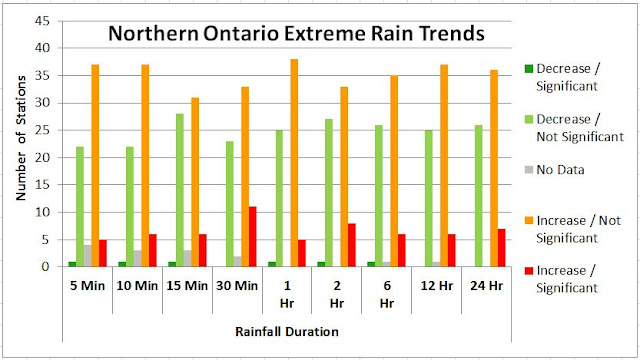
For northern Ontario climate stations there are more increasing than decreasing trends.

Ontario climate change IDF

Ontario climate change rain


Over time, the average maximum rainfall intensity is statistically expected to increase as the sample size increases, without indicating a change in the underlying rainfall characteristic. This is so for all skewed probability distributions as any additional sample values (i.e., annual observations) that fall in the extreme tail push the observed mean higher. To illustrate the skew in observations, the following table excerpt from Environment Canada's IDF table (idf_v2-3_2014_12_21_615_ON_6158355_TORONTO_CITY.txt) shows the positive skew values for 5 minute to 24 hour annual maximum observations from 1940 to 2007:

Ontario storms climate change
Toronto City (station ID 6158355). Positive skew in rainfall distribution for all storm duration. Coefficients of variation of
0.408, 0.355, 0.400, 0.419, 0.393, 0.360, 0.349, 0.318, and 0.306 indicate that sample mean will be biased for small sample sizes, resulting in increased rainfall intensities over time as sample size increases and positive skew observations are added to the sample mean result. Hence mean extreme rainfall will increase without an increase in the underlying rainfall patterns, but instead as a result of the sampling methodology for small sample sets of  rainfall 'population' with a skewed probability density function (i.e., stationary distribution with no underlying climate change related trends in extreme rainfall). 

The following charts show histograms of 5 minute and 24 minute annual maximum observations for Toronto City gauge, illustrating this skew characteristic.


The following charts show how sample size affects the ability of samples observations to approximate the mean of an underlying distribution, and how population skew affects the trend in samples mean. This is from Kirk G. Fleming's article "Yep, We’re Skewed", VOLUME 2/ISSUE 2 CASUALTY ACTUARIAL SOCIETY.


Mr. Fleming writes: "Figure 1 shows three lognormal curves, each with a mean of 1,000 and with varying degrees of skewness. As the skewness increases, the mode or highest point on the distribution is associated with points closer and closer to zero.1 For a lognormal distribution with a coefficient of variation (CV) of 2.0, the most likely value for a sample size of one is relatively close to zero, no matter how big the mean of the distribution. For small samples from this skewed distribution, the most likely value for the sample average will be close to zero.

In order to give a feel for what makes up a small sample size, I simulated random values from a lognormal distribution with a mean 1,000 and varying degrees of skewness. The modes for the sample averages of various sizes are shown in Figure 2 for lognormal distributions with a mean of 1,000 and CVs of 0.5, 1.0, 2.0, 5.0 and 10.0. For individual claim size distributions that have low skewness, the most likely value that we will see from a sample average very quickly approaches the mean of the distribution. Many introductory statistical textbooks give a rule of thumb that infinity begins at a sample size of 30, and for low skewness 30 does seem to be a magic number when we are dealing with the lognormal distribution. However, as the skewness increases, it takes a very big sample size before the most likely value of the sample average approaches the mean of the sampled claim distribution.

For a lognormal distribution with a CV of 10, even at a sample size of 500, the most likely value we would see from the sample average is 85% of the distribution mean. Formal credibility formulas aside, I believe many actuaries would consider 500 homogeneous claims to be a fairly large database.

With a CV of 10 and a sample size of 10,000, the most likely value we would see is still only 96% of the mean of the distribution. A simulation size of 10,000 is not an uncommon size for actuaries doing simulations. Even with this large sample, there is still a downward bias of 4% from the actual average of the distribution."

****

Looking at Toronto rainfall data, assuming a log normal distribution of annual extremes as in Fleming's example, and that the CV is in the range of 0.3 to 0.4, this suggests a sample mean would increase over the first decades of the observations as it approaches the true population distribution, and would stabilize near the true mean after 25 years or so. Accordingly, any short duration climate station data trends would increase over time. The median record length (number of samples) is 24 years, indicating that many stations would have a bias in rainfall intensity trend. The natural, statistical increase in rainfall can be confused with a change in underlying rainfall intensity (e.g., due to climate change), whereas the observed increase in extreme intensity is only a known sampling bias in a skewed rainfall probability distribution.

Rainfall sample mean bias for skewed distribution results in samples means that are less than the underlying population mean. Underestimation bias increases with higher skew distributions.


****

Extreme rainfall trends in Canada (Environment Canada Engineering Climate Datasets):

Static Maps: http://www.cityfloodmap.com/2015/12/severe-storm-trends-canada-rainfall.html
Interactive Map: http://www.cityfloodmap.com/2015/12/canadian-extreme-rainfall-map-climate.html
Table Summaries: http://www.cityfloodmap.com/2015/12/canadian-extreme-rainfall-summary-by.html
Chart and Table: http://www.cityfloodmap.com/2015/12/top-weather-story-in-canada-2015-less.html
Long-term Station Table: http://www.cityfloodmap.com/2015/12/long-term-climate-change-short-term.html
Environment Canada Denies Changes: http://www.cityfloodmap.com/2015/10/bogus-statements-on-storms-in-cbcnewsca.html
Contradicting Insurance Industry Claims: http://www.cityfloodmap.com/2015/12/trends-in-canadian-shortduration.html